
Moxy: nail your next interview
If time is short, check out the 3 minute product pitch video, or the 1 minute summary below.
For a more detailed walk though, scroll down the page or contact me using the magic orange button.
summary

Why: Is it a problem worth solving, can it be solved and is there a market for it?
As an experienced professional and unwitting career coach to many students, I had efficient access to a large group of career changers for primary research and testing. Secondary research surfaced job interview preparation as an underserved problem space that is readily addressable with existing technologies. Competitive analysis suggested room to improve in centralization, UX, UI, marketing and pricing strategy. The addressable market is broad and users require little to no educating on the ROI on investing in career progression.
How: build, measure, learn.
Drawing from primary research insights, I synthesized a persona, experience map and HMW question. These were developed into user stories and task flows addressing the pain points and behaviors discovered. Taking inspiration from common UI patterns and heuristics, I sketched exploratory solutions. A direction was chosen based on user consultation and turned into a low fidelity prototype. Two rounds of scripted guerrilla testing were carried out, and the prototype iterated based on an impact/effort analysis of the findings. An atomic UI library was created for use by future designers and developers working on the product.
What: branding and marketing.
A brand identity was created and refined using ‘more A than B’ mapping and mood boards, based on user preferences and associations. The logo, icon, word mark and color scheme were all designed strictly to support the brand attributes, ensuring that the typography pairings and all color permutations meet AAA WCAG accessibility standards. Rounding off the project is a mockup of a responsive marketing website, with appropriate copy, and a product pitch in the video above.
Outcomes: learnings.
There should be a number of longitudinal metrics here - traffic to the marketing site, app downloads, account registrations, monthly active users, video uploads, comments, and so on. As this was a coursework project however, the main learnings were that I am a champion of user research, prolific in ideation, fast in prototyping and not attached to outcomes. The areas I need to work on is controlling creep in secondary research and improving my systems for synthesizing interview findings.
Full story below. 8 minute read. Let’s do this?
problem
Secondary research
The pandemic accelerated seismic shifts in the way we live and work. With ‘The Great Resignation’ in the headlines, I researched job satisfaction levels, career changes, the shift to remote work, the economic impact of COVID, how people choose vocations, career planning, mentorship, aptitude tests… until I got analysis paralysis.
My first learning on this project was to curb my passion and focus my curiosity on what specific problem I can solve, and for whom. I turned to the potential users around me to help me narrow down the scope. After listening to their experiences and concerns, one acute area stood out as almost universally painful, underserved and ripe for design intervention - job interviews.
Further research revealed that a staggering 39% of job candidates get rejected because they don’t appear confident during at their interview. On the other side of the table, the average employer will spend $4k on the hiring process, and often much more. The paradox is that although both parties want to find a match, the interview process is a nerve wracking and unsatisfying experience for many.
process
Primary research
I had hit on a problem that resonated with me, but it's not called 'designer-centered design'. To validate my assumptions and proto-hypothesis, I set up calls with people from Canada to Qatar, targeting career changers and people who had recent experiences of job interviews. I also took this opportunity to learn how to use Dovetail to organize and synthesize my interview findings.
The pain points I discovered included landing interviews, inconsistent role titles, curve-ball questions, mindset, practice, biases, feedback, sweaty palms, badly fitting suits and more. Again I couldn't target them all, or solve the problem for everyone. I prioritized three areas of insight that have the potential to reinforce each other in terms of user benefit - study, practice and feedback - and asked myself…
“How might we help busy professionals feel more confident about job interviews?”

User journey
To map out the cycle that perpetuates this issue I condensed my insights into the journey of a persona, and called her 'Dolores'. See what I did there...?
Interviewing, much like public speaking, negotiation or singing for that matter, is a skill in itself, and can be considered separately to the content being communicated.
As an experienced educator, I know that improving a skill requires study, practice, and crucially, feedback, to enable a growth mindset. Some of the best learning happens in groups, by modeling and mimicry, and if this is reinforced by constructive feedback, it builds into a loop of positive self directed improvement.
Unfortunately the interview experiences in my primary research had been far from a positive learning journey. Although capable and competent, users never felt sure what to expect and feedback was virtually non-existent.
Ideation
I’m a teamwork kind of guy, so I drafted in a few friends to ideate potential solutions. I firmly believe that many heads are better than one, and including the perspectives and expertise of others produces unexpected insights, richer ideas and better solutions.
I ran a brainstorming session with my classmates, and an ideation workshop with the designers at the meetup I organize. Our user stories focused around four epics - knowing what questions commonly come up; getting tips on structure and model responses; recording oneself practicing interview answers; and storing those recordings, for review or feedback from others. That night I was excitedly sketching user flows and exploring screen designs on the metro home.
Prototyping, testing and iterating
Only a few weeks into the course, I didn’t feel overly sure of my visual design skills. I made the rookie mistake of jumping into neumorphism for UI inspirations, hoping it’s cool factor would boost my credibility.
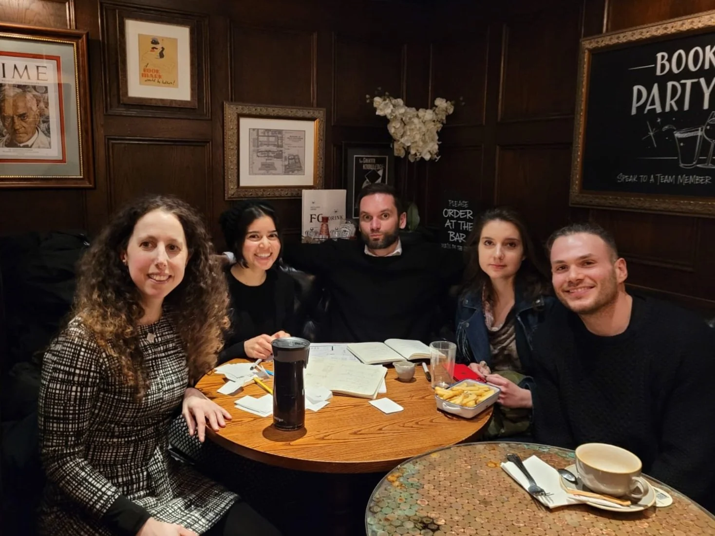
It’s safe to say that Londoners relaxing in a pub on a quiet Sunday night were not expecting an excited designer to test an app on them. Nevertheless, the users I interviewed thoroughly validated the concept. They also called out problems with the UI, because in my neumorphic experiments I deviated from good UI patterns and heuristics in favor of appearance and ‘cool factor’.
I prioritized my test findings on an impact-effort matrix, and then implemented the ones that would bring the most benefit to the user. The next testing round showed that the usability issues had been resolved but the role of the homepage, social feed and ratings was not intuitive.


It was clear what had to be done - a redesign by subtraction, of both the functionality and the UI. I created a new inspiration board that reflected a cleaner, minimal feel, having learned to be more confident and methodical in translating my aesthetic preferences into my designs. The simpler UI patterns were designed to contain more reusable components, which would make creating an atomic library, as well as the hypothetical development of the app, much easier.
I refocused on the core functionality and value. Referencing fitness and habit tracking apps, I reimagined the homepage and de-emphasised the importance of social features, restricting them to video comments. The third set of user tests was a resounding success!
Under the hood
I knew that a design system and a UI library are the foundation of efficient product development but creating my first atomic library seemed like a daunting and labour intensive task. I asked myself 'how might I make redlining feel more exciting and relevant' and the answer became obvious - use green lines! Just kidding.
I talked to the developers on the parallel cohort, getting more insight into their process, and how well thought out components and patterns made their work much easier. Connecting my work to the broader product lifecycle motivated me, and added to my understanding of cross functional team work, setting me up well for the hackathon ahead. There are no situations that can’t benefit from more empathy and design thinking.
branding
Attributes
I began by mapping out the feelings and attributes that synergize with the core value proposition of my product - to help my persona with interview preparation? I created a list of attributes that were opposite to the frustrations in their journey.
The ‘more A than B’ technique allowed me to hone in on the qualities I want the brand, color palette, iconography, typography and overall user experience to convey.
Mood and colour
Translating the brand attributes into images gave me a basis for creating a visual identity, that ties together the values and aspirations of the brand across the design, and supports both functionality and delight in the user experience.
The final choice of colours focused on blue and green hues, to convey an ambience of security, stability, growth and perhaps even money.
Accenting these shades is a golden yellow, tinged with orange, suggesting joy, excitement, adventure and again, perhaps even precious metals.
Finally a the necessity for a functional highlight emerged during colour injection, to be used in icons such as ‘record’ and ‘stop’, which the user is accustomed to seeing in hues of red.
All three main permutations of the neutral, primary and accent colours meet AAA WCAG standards when used to display text and icons. This means that as many users as possible, including those affected by visual impairments, will see the text in high contrast and be able to navigate and consume the information they need.
Name
I wanted to explore conceptual associations around job interviews, so I went back to my users and played a few rounds of ‘word association’. Pattern emerged out of the resulting word cloud, and led me first towards careers and conversations: career cafe. Despite the pleasing phonics and alliteration, I wanted a compact wordmark so pivoted into fewer syllables.
Thinking of skills, which are both what interviews are about and how the product frames interviewing itself, led me to surface an old fashioned term perfectly encompasses the brand values of energy, determination, courage and know-how: moxie.
Given its ambiguous phonemics, I asked several potential users, particularly non-native English speakers how they would spell the word. The results varied, and led me to adopt a simplified 4 letter spelling that also fits in with tech naming trends.
Logo
At first, the triangular letterforms in MOXY suggested arrows and upward motions. However, the angular forms are at odds with the calm and flowing brand attributes. I wanted to infuse these attributes into all aspects of the user experience, so I explored cursive scripts, that suggest fluid and elegant motion, along with pedigree. The stroke of the lower case ‘m’ also evokes the curve of a ‘squiggly’ career.
Wordmark
The wordmark can be a powerful and recognisable symbol for the brand. Like the other assets, it was important to me to harmonise the design of the wordmark with the brand attributes and the assets that preceded it.
I explored several display and cursive fonts and compiled a font moodboard to get a sense of how they feel alongside the brand moodboard imagery.
A final but critical consideration is how visible, legible and accessible the wordmark is under different conditions, for example in various colour combinations, from a distance, or as a neon sign. Most of the fonts were discarded based on this final criterion, and in the end I settled on Playball.
I designed the wordmark by shaving the first downstroke of the ‘m’ to bring it in line with the look of the logo. I then removed the linking loop of the ‘o’ to take attention away from it, and simplified its link to the ‘x’.
Finally, I brought all the letters closer together to give a cozier, friendlier feel. I experimented with removing the serifs of the ‘y’, but decided to keep them as they hinted at upward motion, and the strokes looked too sharp without them.
product
Get some Moxy
Moxy is a mobile app that allows users to study, practice and get feedback on interview techniques and answers. At its core lies a database of interview questions, organised by industry and position. Each question is rated by how frequently it comes up in interviews, based on user feedback.
Users will choose the industry they are interested in during onboarding. The search functionality assumes no pre-existing knowledge of the field and allows the user to browse common job titles and the possible interview questions associated with them.
Selecting a questions gives access to curated model answers and technique tips, including transcripts for situations when reading is preferable. The user can also see answers published by other peers, encouraging feedback and horizontal mentoring.
All questions and videos can be bookmarked and reviewed in a separate section of the app. The bookmarked questions can then be treated as a playlist for the practice sessions, alongside question lists curated by job title.
Once recorded, the user can choose to save the video to their device or publish them to the community to receive feedback from others.
Marketing and next steps
I created a responsive marketing website mockup that fits into the branding and tone of the app, tackling acute pains in a users career with simplicity, softness and a degree of playfulness. Having been inspired by my research since the projects completion, I am considering iterating on the landing page, and a live launch to validate the idea on real users.
In the time of the Great Resignation, I believe that from a product perspective, the timing could be perfect to further research, develop and launch a suite of tools that will help people make sense of the changing world of work.
Still here?
Thanks or making it this far.
I’d love to know what you thought. Get in touch using the big orange button.
(Especially if you got the Trainspotting references).