
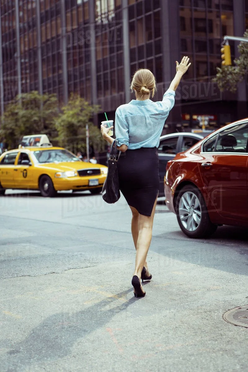
Cher: car sharing for her
Cross-functional team hackathon (24h).
Human-Centered design.
If time is short, check out the 1 minute tl;dr below.
For a more detailed walk though, scroll down the page or contact me using the magic orange button.
tl;dr

Prepare
A team of 2 designers and 2 engineers would work on a secret problem space. I organized team alignment meetings to map out our capabilities and expectations ahead of kickoff. A ticketing system was created by combining Figma functionality with a custom template, alongside a Notion workspace and kanban board.
Build
In the first 8 hours , the team carried out secondary research, narrowed the problem scope, conducted user interviews, synthesized insights, ran cross functional ideation, researched UI patters, created a lo-fidelity POP mockup, guerrilla tested on users. With the fundamental elements set, the engineers began coding, while the designers derived the brand colors and produced a high-fidelity Figma prototype. The next morning, we iterated by streamlining and cutting down the prototype, refined the copy, created a user database and red-lined patterns and continued to align with the dev team, while working on the storytelling and visuals of the pitch deck.
Learn
The forethought put into the process and a source of truth increased efficiency and alignment, and cut the need to micromanage. My primary research initiatives made us the only team driven by first hand user data. With more time, two rounds of user testing would be conducted. The primary research and testing would also be used to create an audience for a social media ad campaign to gauge the levels of interest and cost of user acquisition.
Full story below. 5 minute read. Ready to roll?
prologue
5 P’s - prior preparation prevents poor performance
I was fired up about the BrainStation hackathon for weeks. The pace, energy, new connections and sense of achievement at these events are hard to beat, and especially in person! The specific problem space of the hackathon was a closely guarded secret, but that didn't mean there was nothing we could do to prepare for the challenges to come.
Once the teams were chosen, my top priority was getting the designers and developers on the same page about what they do and how they do it, and in particular bringing the devs into our design processes.
To anticipate and streamline the intense work ahead I created a Notion workspace. The team then collaborated on a ticketing system for developer handoff, set up though a combination of a segmented Figma canvas and the built in commenting feature.

Problem space: sharing is caring

When the problem space was revealed, we focused on secondary research to find the biggest players and factors in this hot topic.
We were shocked to unearth that nearly half of transportation pollution is caused by people driving cars on their own. Not for the first time I wondered why we continue to design and build 4 and 5+ seater wagons as standard, when most people drive solo. While redesigning how our culture thinks of personal vehicles altogether would be a worthwhile ambition, we were mindful of our limitations and expected deliverables.
Household names in ride sharing have made getting into a car with a stranger a common transaction, but could we go further? This was an opportunity to discover how people feel about sharing cars and what we can do to improve their user journey, while reducing the impact on the environment.
build
User interviews: an unexpected journey
No matter the time constraints, design without primary research is not design. Users know more about the solution than we do.
Our insights fell into three broad categories:
Making small talk with strangers is awkward. We seem to have collectively learned to airbrush taxi drivers out, and look anywhere but at our fellow public transport passengers. Sharing a car, especially with multiple passengers would require some ice breaking.
It would also require trust. Online transactions with strangers based on how other strangers felt about them have become the norm, while the perceived risk of hitchhiking and couchsurfing has increased.
The pain point that struck us most, however, was that women did not feel comfortable sharing cars with men. When women's voices are growing stronger but harassment continues to be a problem, we saw an opportunity to achieve two complimentary goals.

“How might we make the environmental impact of car sharing more appealing and safer for women?”
The who
To counteract bias, keep us focused on the user needs and 'rubber duck' us through any design bottlenecks we created a persona. A young woman, regularly working late and going out in London. She would love to reduce her carbon footprint and taxi bills, but is concerned about the lottery of finding someone to share with and finds men in London 'very confident' (actual user quote). As a user she was focused on 3 core needs: to match with other women, know what she has in common with them and choose who to share with based on user ratings.
Ideation: fast and furious

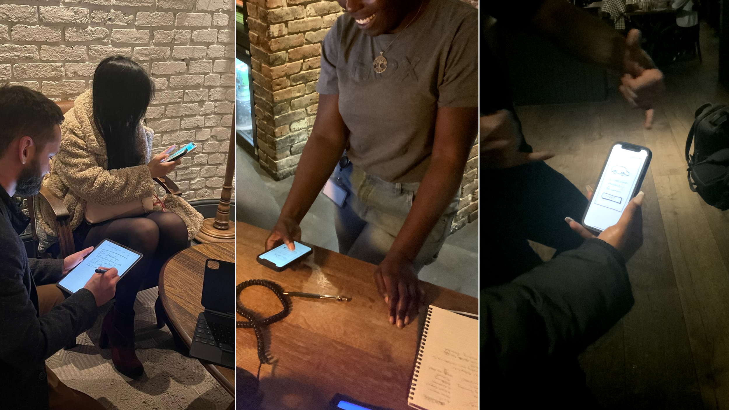
The hour was getting late, and we needed nourishment. We holed up in a hotel bar in Hoxton and embarked on a round of competitor research, burgers and crazy 8's, focusing on how we can connect passengers for regular or ad hoc carshares. With creative juices flowing, we came up with ideas ranging from wireless proximity scans to messages in lights on wearables.
Our brief was to deliver a coded prototype and presentation by 1600 the next day, and keeping the constraints of our development team in mind, we narrowed our scope to a mobile app with profile, search and messaging functionality.
Solution sketching: keep it simple
Clean and minimal UI would not only provide the user with a heuristically pleasing and uncluttered experience, but allowed us to create a lean template with reusable components, streamlining both the design and development process.
We remixed inspirations and UI patterns of the core functionality and rapidly moved to the first sketches of our proposed solution.
Testing
It’s imperative to put the proposed designs in the hands of the user as early and often as possible, so using the Marvel POP app, I mocked up a prototype and spoke to women from all walks of life right there in the hotel bar.
The results: 1 offer of investment, 1 offer of a date and 1 in 3 users confirming that they would in fact feel uncomfortable sharing a car with a man, especially after an evening out! We had the first signs of product-market fit.
Branding
By this stage, our dev team was busy creating the core components, while we set about refining the visual design. The colour palette was extracted from a moodboard that evoked rest, calm and security. We made sure all the colour combinations met the WCAG accessibility standards.

With further refinements, and several missed tube trains, I perfected the graphic elements and cut down one screen, while my colleague redlined the components, ready for developer handoff.


The brand name was a stroke of inspiration, that combines the phonetics of 'share' with the wordplay of 'a Car for HER' and an association with a female pop icon!
Iconography also influenced the logo design, fusing two ancient Greek symbols for Venus, to represent connecting women, while simultaneously hinting at a smiling, winking face, an origin and a destination, and even a car, if the logo is inverted.

Having maintained constant communication with the dev team, our design was informed by their input throughout, and handoff was seamless. The design team even got to write the JSON file for the user database!
Finally we built a narrative and delivered an outstanding presentation, highlighting the problem space, design process and user feedback.

Future development
Had there been more time, the first priority would have been user testing, and more user testing, to refine the functionality and define the metrics to measure and improve product-market fit. A landing page and a small targeted advertising campaign would show potential market appetite and a rough cost of user acquisition, allowing us to consider various business models, as a standalone product, or an addition to an existing digital solution.
With driverless taxis just around the corner, and an increasing appetite for human connection, the timing could be right for a more community based approach to sharing cars to help the planet.
Still here?
Thanks or making it this far.
I’d love to know what you thought. Get in touch using the big orange button.